

Jyoti Shinoli immediately sensed that something was off when she was reporting from Maharashtra’s Nandurbar district in 2020. A question she had been asking a few Adivasi men was only answered with blank stares.
“Vatavaran badal che tumhala kahi parinaam distaat ka?”, she had been asking in Marathi. It translates to “What impacts of climate change do you see?”.
“The moment I said ‘vatavaran badal’, I knew that it sounded strange,” says Shinoli, a senior reporter with People’s Archive for Rural India (PARI), over the phone. “Conversationally, ‘Vatavaran’ would mean water or wind, and using it as a translation for ‘climate change’ just did not seem to bring out the same intensity of the problem. People could not understand what I was asking.”
Shinoli then began breaking down the elements of climate change, devoid of a definition that is otherwise loaded with technicalities of degrees, temperatures, and complicated graphs. Soon enough, she found that conversation began flowing amongst Nandurbar’s residents. Yes, there had been a change in rainfall, and yes, agricultural patterns had in fact changed.
Yet, these changes should not be surprising. After all, amongst all districts in Maharashtra, Nandurbar has been reported to be the “most vulnerable” to climate change. While its impacts are evident and are being felt, the term ‘climate change’ or a Marathi translation of it has not been in the public consciousness of most residents living in this ‘most vulnerable’ district.
The residents of Nandurbar are neither alone nor ignorant. A 2012 survey of over 4000 Indians working across the fields of agriculture, labour, and salaried employment found that only 7% knew “a lot” about global warming, while 41% had never heard or “did not know” about it. Interestingly, after the surveyors gave a short, simple definition of the phenomenon to these Indians, 72% responded by saying that global warming was indeed happening. Just like Nandurbar’s residents, they had observed changes without connecting them to the larger crisis of climate change.
Albeit crucial, complex and data-heavy reports like the recently released Intergovernmental Panel on Climate Change (IPCC) do not seem to be helping with communication either. In fact, a 2021 US-based study found that many terms and phrases such as ‘mitigation’, ‘carbon neutral’, and ‘unprecedented transition’ mentioned in these reports are “too technical” and “unfamiliar.” Even these terms’ explanations in reports are “too wordy” and “full of jargon,” the study found. What’s even more worrying is that over the years, these reports communicating climate change have become more difficult to read, as a 2015 linguistic analysis found after analysing published reports between 1994 and 2014.
While there could be many reasons for this communication gap, studies have shown that mass media can play an integral role in shaping public understanding of climate science. In specific, the news industry has and will continue to create a significant ripple effect by spreading awareness, influencing attitudes, and sharpening knowledge about climate change—all of which instil environment-friendly behaviour amongst readers.
Seen in this light, journalists and media houses become front runners for creating awareness by telling tales of the current climate crisis in a language that can be understood, empathised with, and acted upon. Communicators of climate science also find themselves armed with local ways of understanding and reporting climate change’s impacts, along with digital tools and graphical interfaces to tell these stories effectively.
Changing the Language of Climate Change
“Once we started speaking about climate change in Nandurbar, I realised that millimetres of rain and degrees of temperatures were not indicators that residents associated with,” Shinoli says. “Instead, they spoke of species of frogs that they had stopped seeing over the years, or seeds they stopped storing. These could also be crucial indicators of a changing climate. To be sure, I try to find scientific experts who could also corroborate this causality.”
Shinoli not only makes her English and Marathi reportage heavily based on such ground experiences and narratives, but she also includes local terms that her interviewees speak about. One such term on her recent trip to Nandurbar was “Jadhi”. “Although I’m fluent in Marathi, I had not heard this term before. The men then explained that this was a period of 10-15 days of rainfall, which used to be frequent earlier, but does not happen anymore. I include such terms as I hear them in my stories, with its meaning in brackets, so if other Marathi readers go through it, they will have a sense of familiarity.”
This language gap that Shinoli is filling is crucial to change the current trend of climate news. When climate analyst Anu Jogesh analysed English news dailies between 2010 and 2017, she found that politics and policies around climate change formed the largest chunk of climate change-related information in newspapers, accounting for about 60% of published content. These broadly covered Indian and international negotiations around climate change, national and sub-national plans for the same, amongst other things—themes that are generally not of direct concern to those experiencing these impacts, besides them being loaded with technicalities.
What would probably be more relatable, a category that Jogesh called “climate science and its impacts”–like the impacts of climate change that Nandurbar’s residents alluded to–only accounted for 25% of coverage in dailies.
You May Also Like: What Constitutes Good Science Journalism?
Besides changing the narrative around climate change, media houses are also proactively altering the terms they use so as to communicate its urgency more effectively. The Guardian updated their style guide in 2019 to use “climate emergency” or “climate crisis” instead of climate change, and “climate science denier” instead of “climate sceptic”. Earlier this September, The Third Pole also clarified that they would be adopting a different meaning to “climate refugees.”
“The usual definition of climate refugees generally refers to those who cross international boundaries due to impacts of climate change, while those who move within borders are often referred to as ‘internally displaced’,” says Joydeep Gupta, the South Asia Director at The Third Pole. “This seems to have a connotation that people will go back to where they were displaced from, but we are getting more and more stories in which homes that migrants leave behind even within countries are not liveable anymore. So, we will now be referring to such internal migrants as climate refugees to fully capture the gravity of this situation.”
Such changes to communicate the urgency of the climate crisis seem to be working. A US-based study showed participants articles on climate change with exactly the same content, except using different metaphors, like “war against” climate change. Researchers found that reading the articles which were loaded with metaphors garnered “led to greater agreement with scientific evidence” than those without.
In the digital age that we now live in, words are not the only tools at the disposal of communicators and media houses. Many in India are now taking advantage of the magic of visuals, which is something that is right up geo-spatialist Raj Bhagat’s alley.
“Showing” Climate Change
A map-enthusiast, Bhagat has a popular Twitter account with over 28,000 followers, where he creates maps that highlight the impacts of floods, incidences of forest fires, differing temperatures in urban and rural areas, and more. “I love maps,” Bhagat says. “But more importantly, climate change is also a very geographical phenomenon. Whether it is groundwater intrusion or extreme weather events like cyclones, they can all be plotted through maps. Citizens and even government officials are not climate experts, and it is necessary to show them what this complex data can mean for them in the simplest way, and I think maps help do that.”
One of his Twitter threads shows the impact of the 2020 Bihar floods, but with one important detail. He begins with maps to contextualise Bihar in terms of sea-level elevation, the changing course of river Kosi, and then, man-made structures visible through satellite images—embankments created to contain rivers. He ends it with an image of a section of the flooded river, with a clear difference between water stagnation outside embankments, and the much more intense flooding visible inside embankments. His message is clear—these rivers need to be able to sediment, and embankments restrict that, thereby intensifying the impacts of floods.
“Data is always available, what is crucial is being able to convert it into a message,” Bhagat says. “When I’m thinking of a map visualisation, I first think of the story or the purpose that I want to get across, and then come the science, technology, and art of it. I believe that this ability of not just representing facts and data, but telling a story out of it is what makes my work popular.”
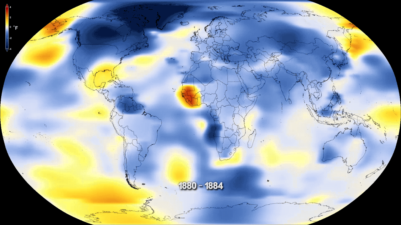
Harry Stevens, news and graphics reporter at The Washington Post sees great value in interactive data visualisations that he creates. “I strongly believe that most people think about concepts and ideas visually. Well-made data graphics can really make the story engaging, which sometimes text alone struggles to do,” adds Stevens. One of his stories, How We Know Global Warming is Real, allowed readers to spin a globe to see how average temperatures have changed since the 19th century. “These kinds of tools that we have now are so much more dynamic than a piece of paper. By letting readers spin the globe, it allows them to put themselves in the story and have their own adventures. It definitely gives a better grasp on the information, a mental image they can refer to later,” Stevens says.
Such interactive and geo-spatial visualisations graphics are gaining popularity, but seem to still be at a nascent stage. As more media houses get on board, what kind of resources might they need to be prepared with?
Building the Capacity to Visualise
“It takes enormous amounts of money,” shares The Third Pole’s Gupta. His team recently experimented with an audio-visual interactive story Lament of the Brahmaputra River Bank, where a reader could browse upstream and downstream of the river, and listen to songs of displacement by floods and erosion which are popular amongst local communities. One scroll through the webpage makes it evident that illustrators, videographers, and graphical experts were all involved in this creation. “We were able to do it because of some funding we had received. Apart from the financials, such stories also needed expertise to upload all this material onto our webpage… It was [uploaded] through complex software and had to be done through a third party.”
The Washington Post’s Stevens points out that the human resource and skills needed to improve visual storytelling are still scarce. “It is encouraging to see that some Indian media houses have small graphics teams, but I think there is a larger problem at hand. Very few people in India who are skilled in doing sophisticated graphics come into journalism, because better incentives are available elsewhere as technicians,” he adds, recalling his experience working in a leading Indian media house a few years ago. “In the US now, a lot of media houses are also hiring inter-disciplinary roles. They are getting people on board who not only create graphics, but can also write stories, find data, and do analysis. This can help increase in-house capacities.”
To ensure that scientific information goes beyond the scientists’ circle, there is not much debate that better communication for this complex phenomenon is needed. The focus needs to turn towards the “hows” of things, to be able to convey that climate change is happening, and that it is happening in front of us.
While journalists remain primary correspondents to make this happen, communication about climate change is also adopting creative paths, from the latest Tik Tok trends to poems, fiction, and art about the threats. This works well and caters to different audiences that relate to different mediums—whether it is Nandurbar’s residents who associate climate change with local terms for rainfall or digital-savvy audiences of Harry Steven’s graphics. The end goal, after all, is telling stories about a rapidly changing climate, which demands mitigation and adaptation efforts from all of us.
Featured graphic of warming stripes depicting annual mean global temperatures (1850-2018) from World Meteorological Organisation data.


[…] Read More: https://thebastion.co.in/politics-and/environment/climate-change/a-little-less-climate-science-a-lot… […]