

A week ago, India reported over one lakh cases of COVID-19. The country is now amongst the top ten worst affected by the virus. Not only have these rising figures induced panic amongst citizens stuck at home, but it has also raised questions about the efficacy of the imposed lockdown and prospects of moving toward ‘normal’ activity.
These questions stem from the fact that we are generally consuming absolute data points, which can create several misconceptions about the impact that institutional measures have had on controlling the spread of the virus. However, a clearer picture may lie in analyzing relative numbers. The following graphs use data between March 14 to May 15 2020 to make sense of what may seem like very frightening figures.
For instance, starting from 5 cases on day one, let’s say we reach 9 cases on day two. Then, although the absolute number of cases reaches 9 on day two, the marginal increase is only 4 cases. Applying this logic to the day-wise COVID data points, the marginal cases have increased, albeit with several fluctuations. However, a more revealing and relieving picture is produced by analyzing the growth rate of active COVID-19 cases.
Transmission of the Virus
In Figure 1, starting from March 14, we find that the percentage of the growth rate of active cases has fallen drastically by mid-May. So, although the COVID-19 virus has been spreading, the speed or rate of transmission has diminished to a large extent.
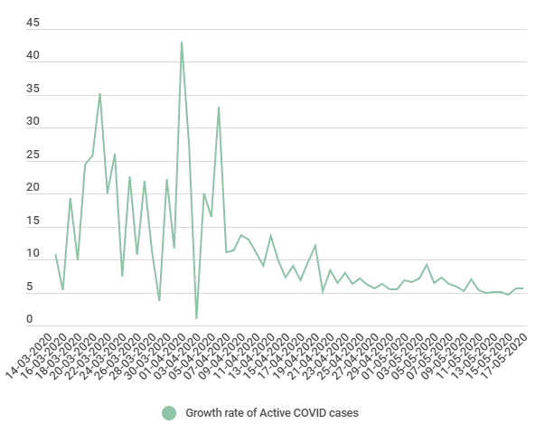
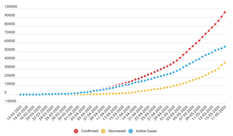
Rather than spreading in a uniform manner, the virus exploded (from 1 case to 5, 5 to 15, 15 to 50). So, just one infected person could infect several others. In mathematical terms, we would describe this as an ‘exponential spread’; the purpose of the lockdown in India was to hinder this exponential growth so as to “flatten the curve”. Even a non-linear growth (as seen with the red line in Figure 2) can be a cause for serious concern.
Fortunately, as the Union Health Minister Dr Harsh Vardhan stated, the doubling time, that is, the time required for the COVID-19 cases to increase from, say five to ten, has grown from almost 5 days on 22nd March to 13.6 days as on 15th May. Our growth rate analysis of COVID-19 data shows similar results.
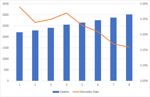
Deaths Caused by the Virus
The mortality rate can be calculated by dividing the total number of deaths in a day to the total number of confirmed cases, which is becoming a fairly relieving statistic. In Figure 3, the graph shows irregular falls, with consistent tapering off post-May 5. But, when figures show huge jumps in the absolute numbers of cases (like from 2871 on May 16 to 3025 on May 17), it is likely to generate great distress amongst viewers.
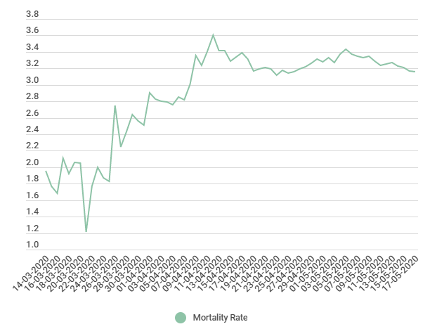
The absolute number of COVID-19 fatalities presents deteriorating conditions for our citizens. However, it hides qualitative information about the country’s improvement: Figure 4 shows how the rate at which people are dying has slowed.
Of course, the mortality rate is the number of deaths per confirmed cases, which means that as India’s testing potential rises, the number of confirmed cases will have also gone up. This increases the denominator, which can cause the ratio to fall. Unfortunately, a significant caveat is that this data doesn’t account for asymptomatic carriers.
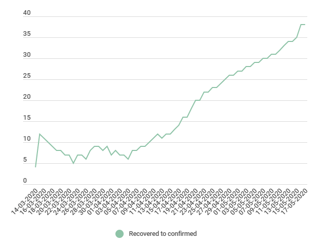
Patients are Recovering
The narrative on COVID-19 must include the number of recovered cases, which is a piece of positive news that the graph in Figure 5 depicts. The percentage of people that have recovered (out of the total number of confirmed cases) has shown almost a consistent increase since April 23rd. This means that the gap between active and recovered cases is being bridged quickly.
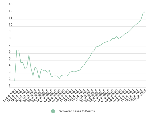
Let’s also look at the ratio of recovered cases to deaths. The ratio and the corresponding graph should increase if either the numerator (recovered cases) increases or the denominator (death rate) decreases. We find that the graph has shown a strict rise, indicating the increasing levels of recoverability to deaths. On average, over 2 months, from 14th March to 15th May, we find 8 out of 9 coronavirus patients have recovered. This could also be heavily influenced by the increase in testing rates and the ability to target healthcare services accordingly.
Unfortunately, most popular narratives haven’t taken into account these simple figures about the COVID-19 situation. The fact that COVID-19 almost grew at an exponential rate has stuck with audiences. However, it is equally important to discuss the efficacy of the lockdown and adequacy of our healthcare infrastructure in controlling the spread.
Greater testing rates would typically mean that the total number of confirmed cases would go up. However, it is important to understand these numbers in relation to each other, rather than as isolated stylized facts. Any improvement in the situation with COVID-19 is an amalgamation of concerted efforts at various levels of governments and other ground organizations, better healthcare facilities (at least in some states) and efforts to gradually ease the lockdown measures across the nation.
Featured image courtesy of Rajesh S Balouria on Pexels


Superbly written and well explained. More than the data it’s important to understand who or what is interpreting that data these days? Sensation/Shock/Click-bait are also valid motives these days. Thankfully your article feels like it’s coming from the right spirit… We all need more of this to help our brains function better in these tumultuous times. Thank you for the reporting.
Thanks, Shrikant!!
Feels good to reach such comments and gives us the courage and motivation to do such work.